
Paul Flack made elsewhere look like elsewhere
The visual journey of elsewhere began with a diagram in a book. Many years ago, in the corner of an antique shop, I found The Voices of Time, a collection of essays exploring time through science and the humanities. Inside was a double light cone dividing space-time into three regions: the past, the future and elsewhere. Elsewhere is the region outside both. Not imaginary, but beyond what has already happened and what is still to come. Something in that idea spoke to me. It inspired the name, but it also set something visual in motion.
For a while, I messed around with ideas myself. Not especially well, but enough to understand how much the visual world mattered. The design couldn’t simply sit on the surface. It had to feel intrinsic to the product, as though elsewhere could never have looked any other way. It had to hold the whole heart of elsewhere: nature, science, regeneration, freedom, time and psychedelia. These slightly strange and seemingly disparate things had to exist together and somehow make sense.
I tried working with a group of graphic design students. I took every one of them - there were fifty! - a product sample, talked to them about the brand and watched them pitch their ideas at the end of the project. There were a couple of interesting responses, but none of them really got it. Perhaps I hadn’t explained it properly. Perhaps elsewhere was just difficult to explain. Either way, the process made me realise that I needed to work with someone who could instinctively see what I was trying to make.
Then I saw a poster for Klanghaus on Instagram and thought: holy shit, yes! Klanghaus grew from The Neutrinos, a Norwich band and art collective whose world I had crossed into years earlier. In my early twenties, I had filmed them at gigs as part of their live visuals. Seeing the Klanghaus poster felt both new and strangely familiar. There was something in it that spoke to me immediately. I asked them who had designed it, and that was how I found Paul Flack.
Paul came to graphic design through the print trade rather than formal training. In his own account, a love of design and a ‘phoney portfolio’ helped him blag his way into his first proper position at Blam, the Soho studio known for its work on the Trainspotting campaign. He went on to work with cult music labels including Tummy Touch and Trunk Records, and with artists including Mogwai, Tom Vek and Red Snapper. His work moved through experimental music, cult film, art and print: record sleeves for Basil Kirchin and Tristram Cary, soundtrack artwork for The Conversation and Blood on Satan’s Claw, posters, books, identities and live visuals.
I felt genuinely privileged that Paul wanted to work with me. His body of work was incredible, but it wasn’t only about that. He just felt exactly right for elsewhere. Paul was unique and just wonderful. Totally honest, no bullshit, very fucking funny and very kind. There was a kind of bigness about him. Not ego or grandness. He was just so alive, intensely creative, very cool and completely himself.
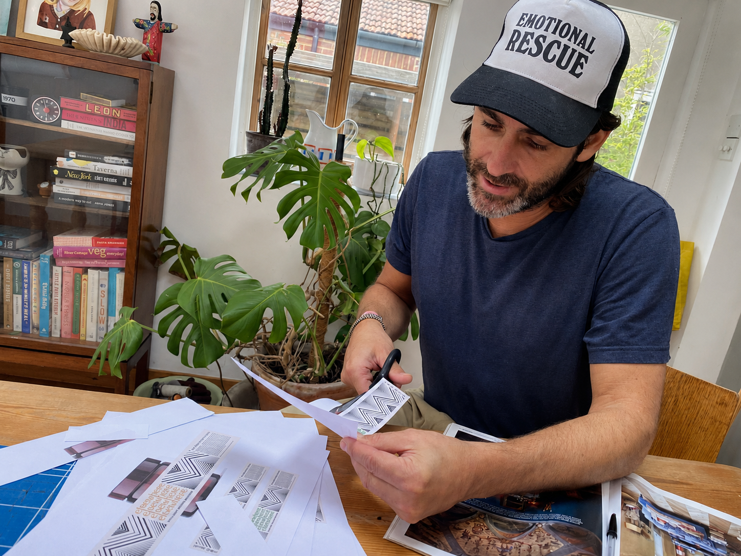
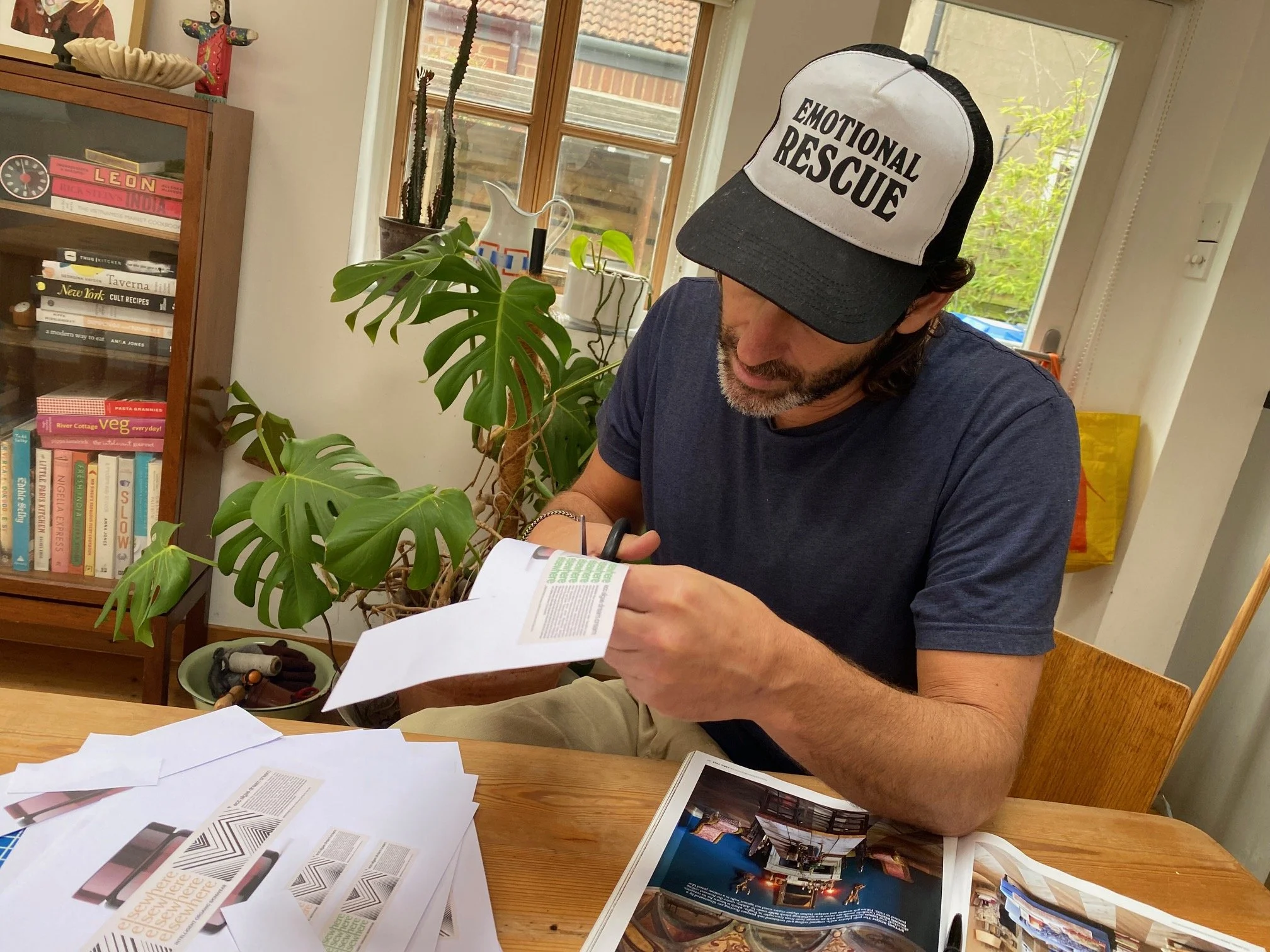
We began corresponding and talking through ideas. I sent him the products so that he wasn’t designing from a brand document alone. He could hold the jars, use the formulas and understand what this thing actually was. Eventually, I went to see him in Norwich. We sat around his kitchen table with three possible designs, scissors, paper and jars, cutting everything out and wrapping the designs around the glass to see how they lived as physical objects.

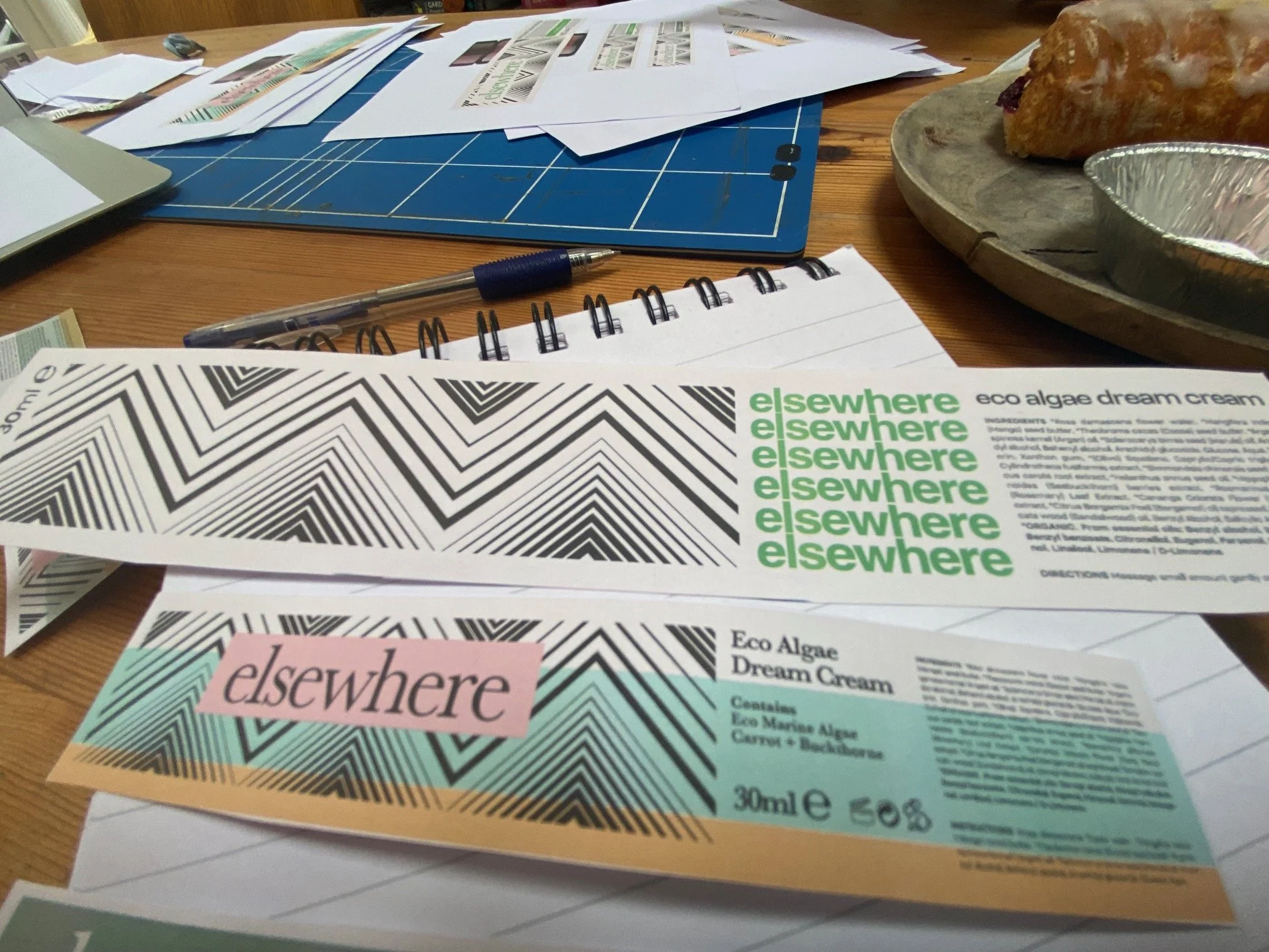
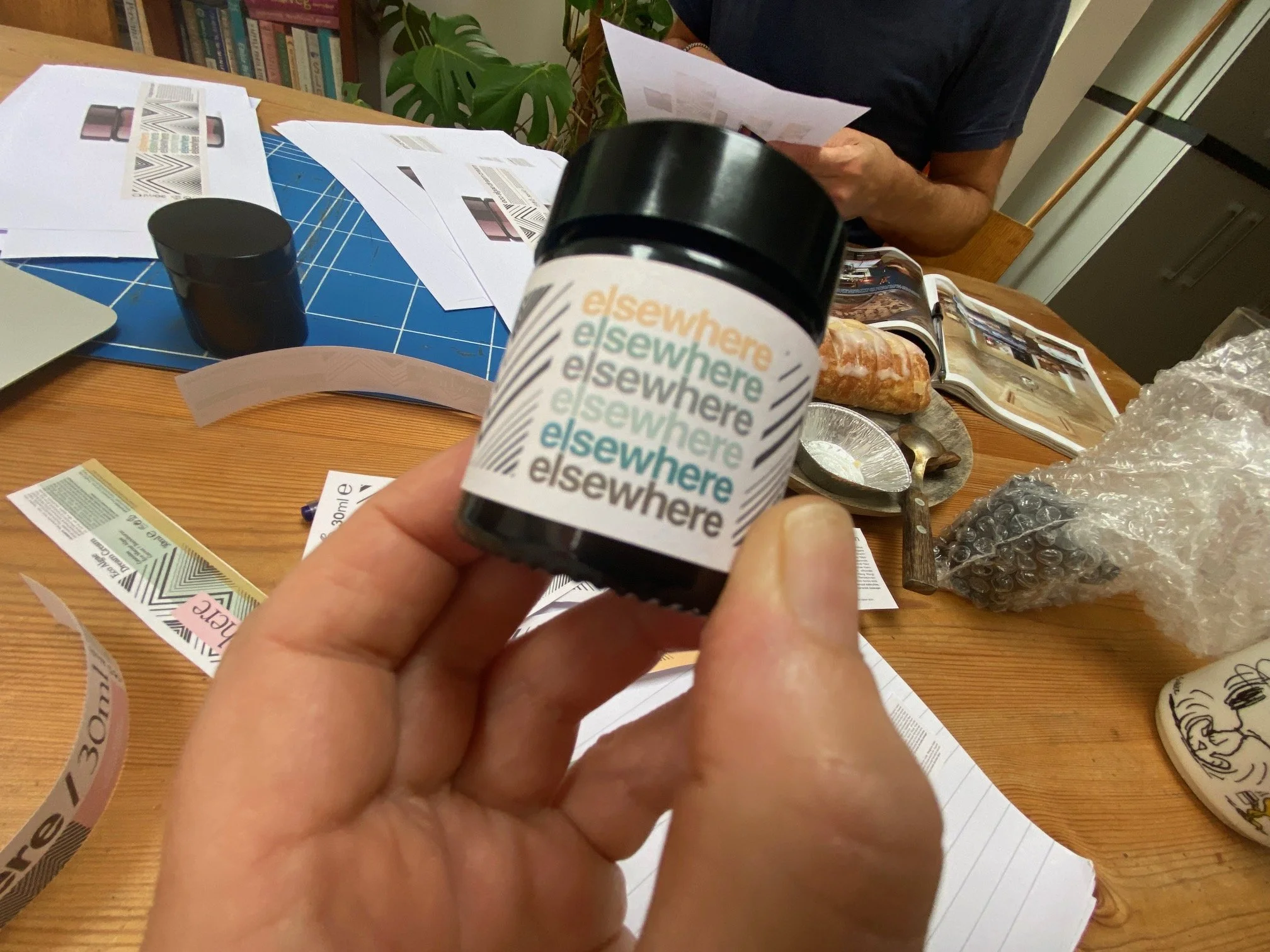
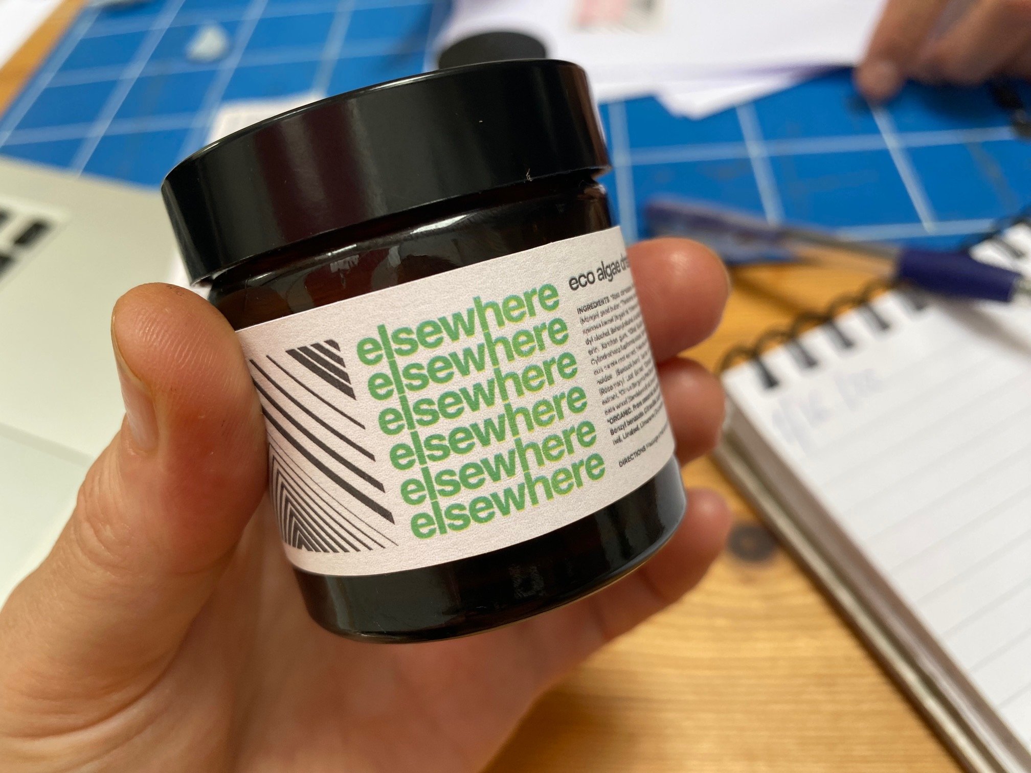
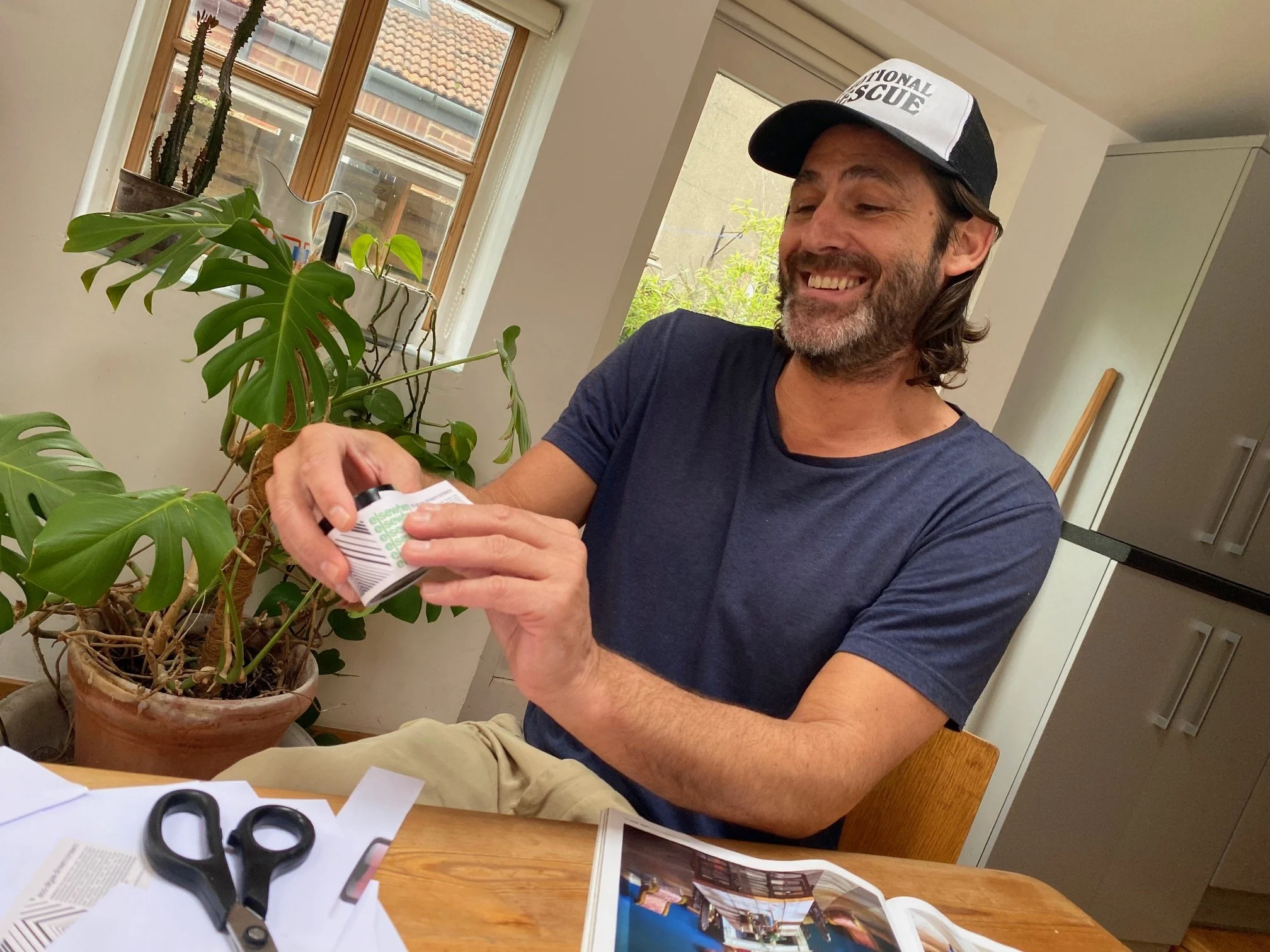
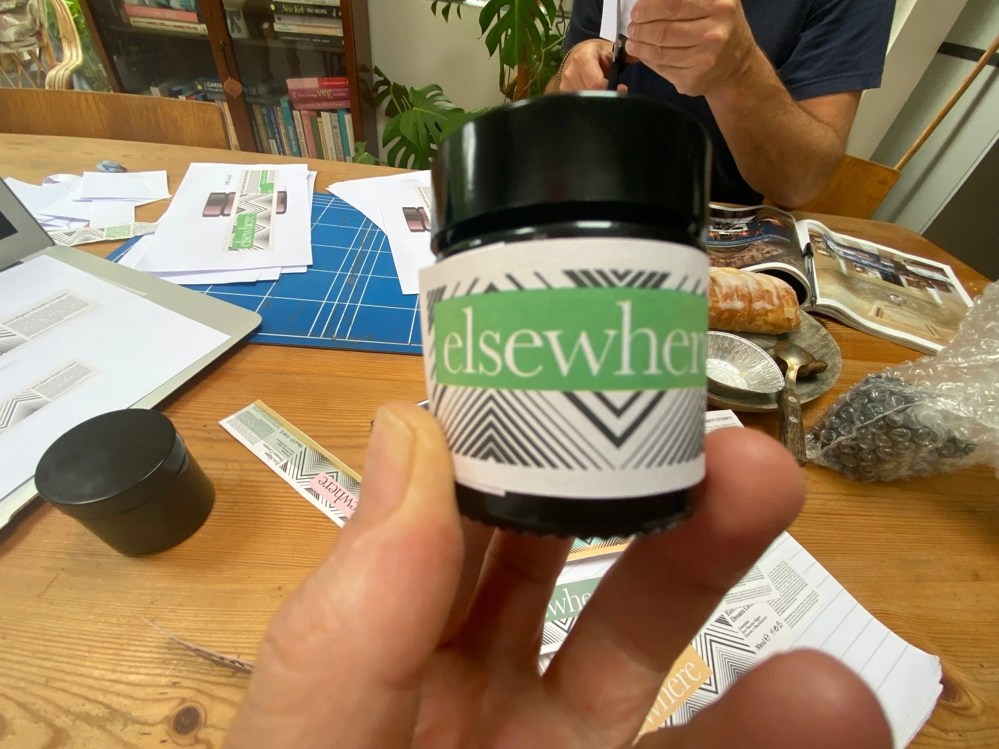
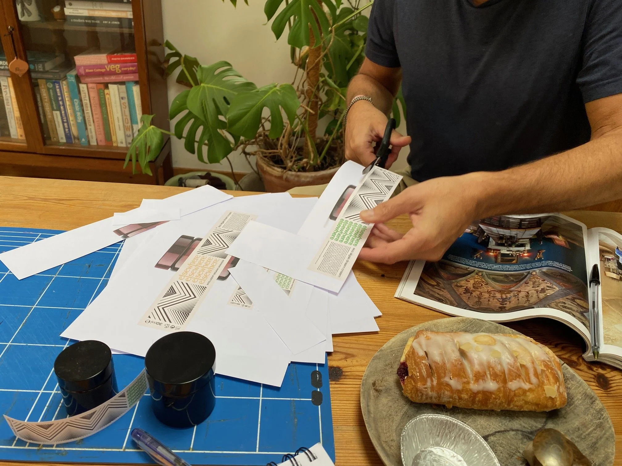
It was genuinely difficult to choose, but the one we chose was ‘the one’. The chevrons (the file name for this was Chevy Chase), the geometry, the type, the way the words became part of the image. It was bold, strange, intelligent and subtly psychedelic. It didn’t look like conventional organic skincare. It didn’t look much like skincare at all. Paul just got it. He really, really got it.
Looking back at an interview about one of his later record sleeves, I can see some of the instincts behind what he made for elsewhere. He described beginning a project by sifting through his many books and his archive of lines, curves, shapes, photographs and unused ideas. He liked to develop several possible directions because one idea could trigger something unexpected in another. He drew on architecture, interiors, vintage arts and crafts, collage and 1960s Italian graphic design. He once described the process as ‘digital fuzzy felt’, which feels very Paul.
There was also the less glamorous reality of designing packaging for cosmetics. Skincare labels have to carry a slightly ridiculous amount of legally required information within a very small space: ingredient declarations, statutory symbols, measurements and batch information. Because the products are made fresh, I also needed to stamp a best-before date onto every jar. This meant Paul had to leave a gap of two or three millimetres in exactly the right place for the tiny date stamp I had managed to find.
There was a lot of back and forth as we worked through the requirements. I researched the regulations, had them examined by Trading Standards and came back with more changes. It was a lot. Paul could have been designing an album cover without any of this compliance shit, but he stayed with it. We found a way to fit everything in without losing the force of the design. Paul understood how to hold a big visual idea alongside the practical reality of an object that had to be printed, cut, wrapped around a small amber jar and legally sold.
We only met in person once, but we continued working together and talked on the phone. Thankfully, our conversations weren’t always about labels. The work was usually just the starting point, and we would soon head off on some tangent. He told me how much his partner liked the cream, so I sent them some more. He always made me laugh.
After my sister died, Paul and I spoke about loss. I didn’t do well after she died, and he understood something about where I was that very few people did. It is difficult to explain how isolating profound grief can be to anyone who hasn’t experienced it. It isn’t their fault, but there is a kind of recognition that sometimes only exists between people who know. I didn’t know then how much that conversation with Paul would come to mean.
I don’t want to pretend that we were lifelong friends. We weren’t. Ours was a creative working relationship that became warm and personal, and I really, genuinely liked him. I loved working with him. I felt lucky to have found him, and lucky that he chose to bring his enormous visual intelligence to this small, emerging skincare brand in Lincolnshire. I’m so sad that he is gone.
Paul didn’t just design a label. He gave elsewhere its visual world. He took something that had existed in my head as a collection of ideas, feelings and fragments and made it visible. The logo still feels as right to me now as it did around his kitchen table. It carries Paul’s intelligence, humour, strangeness and complete absence of bullshit. His work is on every jar I make and in every version of elsewhere that comes next.
Thank you Paul. Not quite sure what we’re going to do without you.